
For Developers

Build with UX4G

Install the packages, render your first component, and ship a government-ready service.

Before you begin

UX4G is built around Indian government service-development guidelines and best practices. Before you start building, make sure you're familiar with these — they inform every implementation decision in the system.

Start here

Are you familiar with government development guidelines?

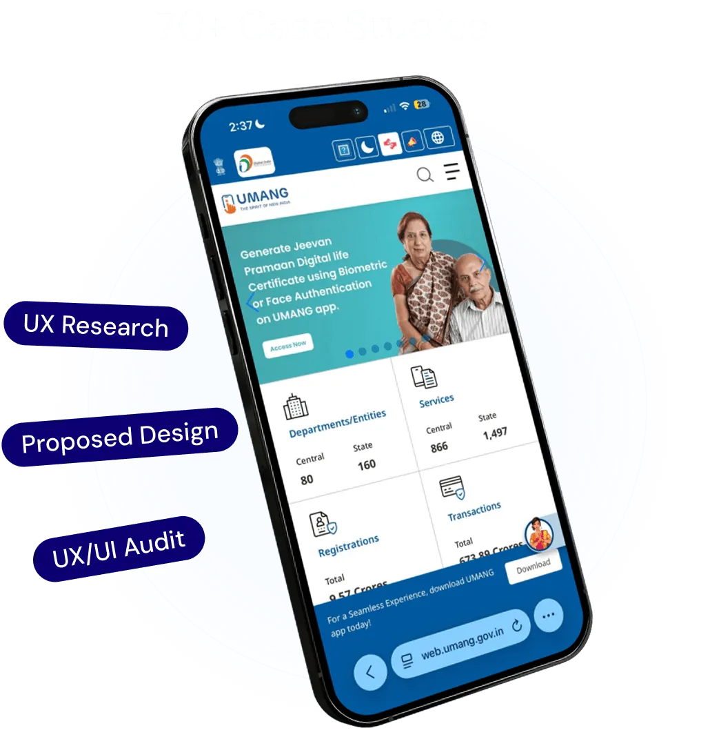
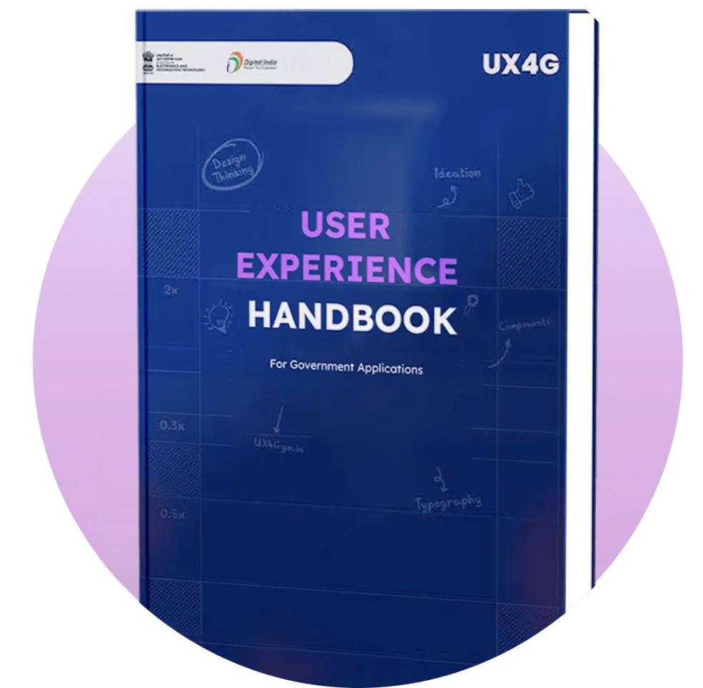
The UX4G website has resources to get you up to speed — including the UX4G Handbook and case studies from real government service implementations across ministries and state portals.

Explore resources

Installation

UX4G ships as a single web package with support for React, Angular, and plain HTML / Web Components. Install once, then apply ux4g-* classes to native markup.

Works with React 17+ and the Next.js app router. Import the styles and runtime once in your entry file, then use ux4g-* classes on native JSX elements.

1Install the package

$ npm install ux4g-web-components

2Load styles, runtime, and use a component

App.tsx
import 'ux4g-web-components/styles.css';
import 'ux4g-web-components/design-system';

export default function App() {
  return (
    <button className="ux4g-btn ux4g-btn-primary ux4g-btn-md" type="button">
      Apply now
    </button>
  );
}
UX4G ships one core web package — there are no separate per-framework component imports. The runtime detects ux4g-* classes in the DOM and wires up interactive behaviour automatically, so the same markup works everywhere.

Design tokens

Tokens are named design decisions exposed as CSS custom properties in the package. They map directly to every UX4G component and can be used independently in custom layouts.

Color

Brand, status, and neutral values used across all components.

--ux4g-color-primary-600
Aa

Typography

Font families, sizes, weights, and line-heights for every text role.

--ux4g-font-display-lg

Spacing

Margin and padding scale on a 4px grid, used throughout layout.

--ux4g-space-4

Shadows

Elevation levels from subtle card shadow to full modal overlay.

--ux4g-shadow-md

Border radius

Corner-radius values from sharp 0px through to fully rounded.

--ux4g-radius-lg

Motion

Duration and easing values for transitions and animations.

--ux4g-motion-fast

Import the token stylesheet

styles.css
@import 'ux4g-web-components/styles.css';

For the full token reference — every scale, every value — see Foundations

Accessibility baseline

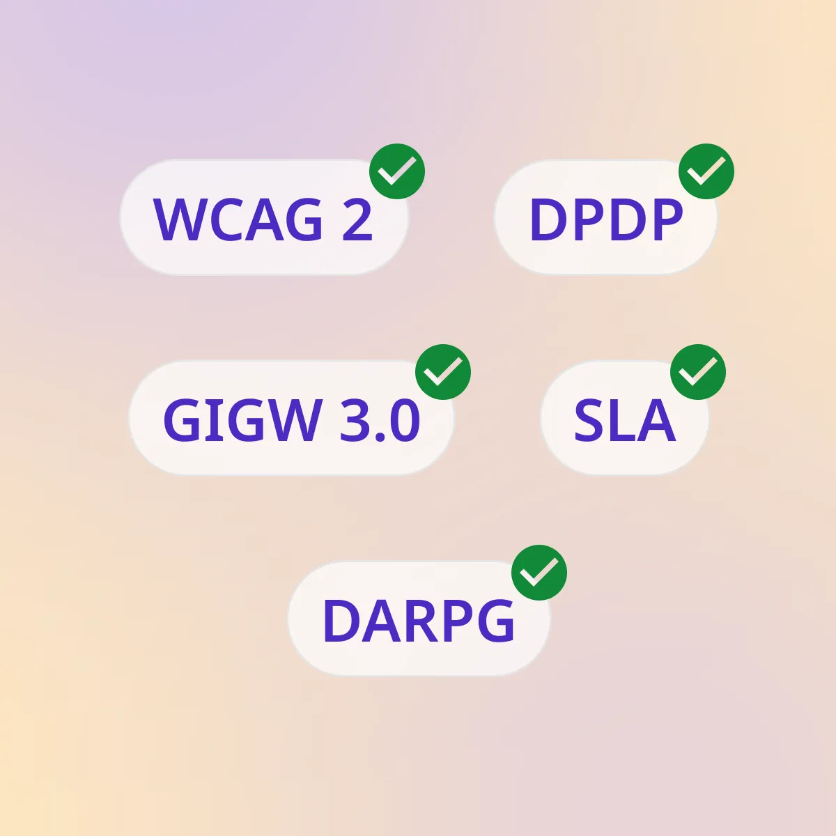
WCAG 2.1 AA is the minimum for every UX4G implementation.

Color contrast

Verify in context, not just at component level. Status colours especially must be checked against their real background.

Keyboard navigation

Every interactive component must be fully operable by keyboard. Never suppress focus styles.

Developer resources

Full component documentation, framework docs, and live examples.

Getting Started

Installation Guide

Add UX4G to any project with npm, pnpm, pub.dev, or a CDN, load the token-driven theme, and start importing components. The same setup carries across React, Angular, Flutter, and Web Components.

  • React
  • Angular
  • Flutter

What you’ll learn

  • Install with npm, pnpm, pub.dev, or CDN
  • Load the token-driven theme and fonts
  • Import components — barrel or tree-shakeable sub-path
  • Verify your setup with framework examples
  • Resolve the most common installation issues
ux4g — bash
$npm i ux4g-web-components
Installing packages
Resolving dependencies
Added 83 packages
Setup complete
$
ux4g.config.json
{
  "theme": "light",
  "accent": "indigo",
  "radius": "8px"
}

Development

Web Core Docs

Component documentation for the web platform — HTML/CSS, React, and Angular in one place. API references, prop tables, accessibility notes, and live, copy-paste examples that carry across every framework.

  • HTML/CSS
  • React
  • Angular

What you’ll learn

  • Install and import components
  • Full prop and event reference
  • Accessibility and keyboard specs
  • Copy-paste code examples
React docs · Button
Overview
Button
Input
Badge
Button
class
size
disabled
<button class="ux4g-btn-primary" />

Development

Flutter Core Docs

The same design system delivered as native Flutter widgets — token-driven theming, accessible by default, and documented with 50+ widgets ready for government mobile apps.

  • Flutter
  • Developer
  • 50+ Widgets

What you’ll learn

  • Static token classes and theming
  • Light and dark Ux4gThemeData
  • WCAG 2.1 AA compliant
  • React-parity component APIs
ux4g_button.dart
class Ux4gButton extends StatelessWidget {
@override
Widget build(BuildContext ctx) =>
Ux4gButton(label: 'Submit');
}
Ux4gButton(style: primary)

AI Tools

Build with AI

Scaffold UX4G-compliant screens with AI assistance. Describe what you need and generate accessible, token-aware components you can refine and ship.

  • AI
  • Beginner
  • Scaffolding

What you’ll learn

  • Generate components from a prompt
  • Token- and accessibility-aware output
  • Editable, production-ready code
  • Works with Kiro, Cursor, and Copilot
Generate a login form…Generate
Editable output

Interactive docs

Explore every component live in Storybook

Component APIs, prop tables, and copy-ready snippets across React, Angular, Flutter, and Web Components — with live, interactive examples.

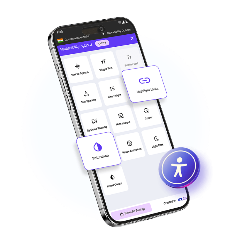
UX4G Accessibility Tool
Dictionary
UX4G Accessibility Tool
Dictionary