


Search Browse and Book
A search-first entry point that pairs a query field with type-ahead suggestions, a results list, and a no-results recovery state so citizens can find and act on a service in one flow.
Global Service Discovery
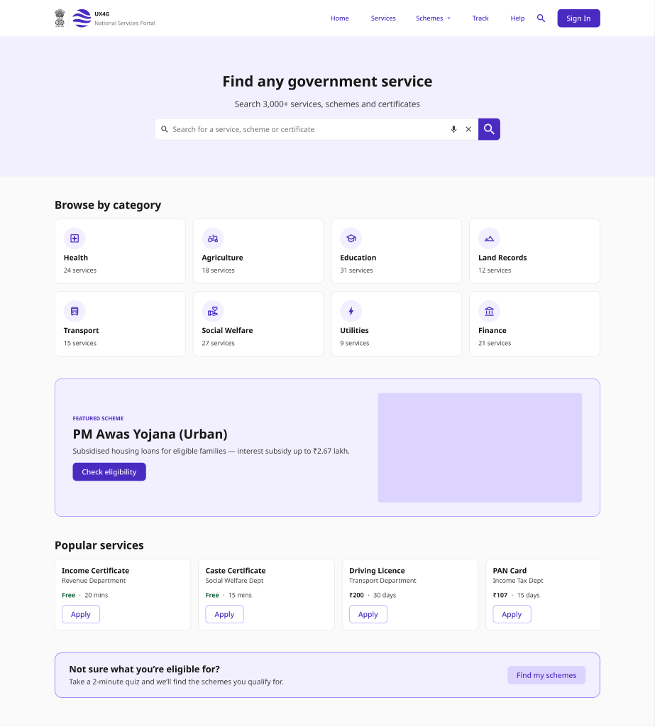
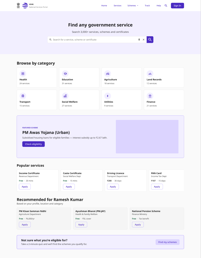
A directory-style discovery flow - a homepage of featured services and categories, category listings, and a service detail page that hands off to the application.
Consultation Slot Booking
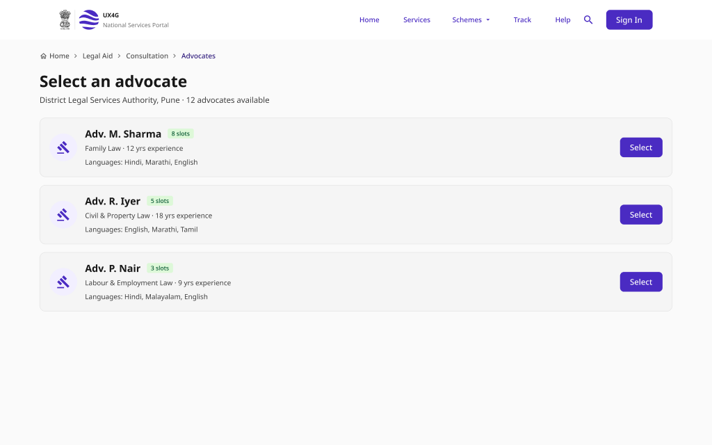
A guided appointment flow for booking a consultation - choose a provider, pick a date and time, review a summary, confirm, and reschedule if plans change.
Pattern Overview
Purpose
Help citizens find the right government service quickly - through search that understands intent, browsable categories, and clear paths to detail and action.
- Surface relevant services from partial or natural-language queries
- Recover gracefully when a search returns nothing
- Let citizens browse services by category when they don't know the name
- Move from discovery to a service detail and booking without friction
When to Use
- A portal offers many services and citizens need to find one
- Users search by everyday terms, not official service names
- Services are organised into browsable categories
- A service requires booking a consultation or appointment slot
When NOT to Use
- A single, well-known service with a direct entry point
- A multi-step application form (use Application & Submission)
- Checking the status of an existing request (use Status & Tracking)
Primary User Goals
- Find a service by describing it in my own words
- Get useful options even when my search misses
- Browse by category when I'm not sure what to search
- Understand a service before I commit to applying
- Book a consultation slot at a time that works for me
Accessibility Requirements
Every screen in this group is built to meet WCAG 2.1 Level AA — keyboard operable, screen-reader friendly, and resilient for low-bandwidth and assistive-tech users.
Search and Suggestions
- Search input has a visible <label> or accessible name
- The combobox uses role="combobox" with aria-expanded and aria-controls
- Suggestion count and updates announced via aria-live="polite"
- Suggestions are navigable and selectable by keyboard (arrow keys + Enter)
Results and Empty States
- Result count announced to screen readers on each new search
- "No results" text explains the miss and offers next steps, not just an icon
- Matched keywords conveyed by text, not color alone
- Each result is a proper link/heading with a clear accessible name
Browse and Service Detail
- Category grid uses a semantic list with descriptive link text
- Service detail leads with a single <h1> and logical heading order
- The primary action (Apply / Book) is a real button or link, keyboard-reachable
- Breadcrumbs use <nav aria-label="Breadcrumb"> with aria-current on the last item
Slot Booking
- Date picker is operable by keyboard with aria-current on today's date
- Unavailable slots use aria-disabled and are conveyed by text, not color alone
- Booking summary is reviewable before the confirm action
- Confirmation and reschedule states are announced via a live region