introduction
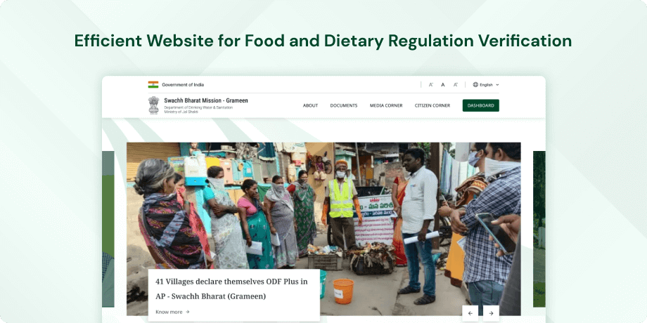
The Swachh Bharat Mission (Gramin), website primarily targets rural areas in India. Phase II of the mission aims to maintain the practice of open defecation-free behaviors. The website offers comprehensive details about the mission, its objectives, and the progress made thus far. Additionally, it serves as a valuable resource for individuals looking to actively participate in the mission and contribute to the cleanliness of India.
Objective
The initial goals of the Swachh Bharat Mission (Gramin) were centered on fostering sanitation, hygiene, and the establishment of toilets in rural India with the intention of eradicating open defecation. Phase 2 of the mission, which prioritizes the sustainability of open defecation-free practices, is designed to secure the enduring maintenance of the beneficial transformations accomplished during the preceding phase.
Target Audience
Based on the information provided, the target users of the website related to Phase 2 of the Swachh Bharat Mission (Gramin) would likely include-
- Rural Residents- The primary audience is likely to be people living in rural areas of India who are interested in sanitation and hygiene practices, open defecation-free initiatives and improving their communities.
- Government Officials- This website may also cater to government officials and organizations involved in the implementation of the Swachh Bharat Mission at the grassroots level.
- General Public- Anyone interested in learning about the Swachh Bharat Mission (Gramin) Phase 2 and its progress, including students, academics and the public.
The website aims to provide information and resources for a diverse range of users with an interest in rural sanitation and hygiene in India.
The Challenge
Enhancing the website's user experience poses the challenge of overcoming potential obstacles that users might face. Notable challenges may encompass streamlining the search process, improving search flexibility, providing more informative feedback, ensuring data accuracy and consistency, optimizing mobile responsiveness, enhancing accessibility, and creating an intuitive user interface.
Usability Study Findings
The issues range from accessibility and navigation to content presentation and visual design. Improving the functionality of the accessibility bar, clarifying the purpose of each section, and enhancing visual elements throughout the site could significantly enhance the overall user experience.
Homepage- Accessibility Bar-The functionality issues in the accessibility bar, particularly the buggy language selection drop-down, need urgent attention. Ensuring a smooth and responsive language selection feature is crucial for users with diverse language preferences.
- Navbar-Eliminate redundancy in the navbar by ensuring that the home icon and logo directly link to the homepage. Improving logo visibility through design enhancements and adjusting contrast ratios will contribute to a more consistent and user-friendly navigation experience.
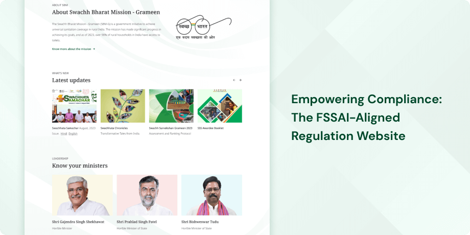
- "What's New" Section-Enhance the visual treatment of the "What's New" section to grab user attention effectively. Consider alternative navigation options beyond relying solely on a scroll bar to improve discoverability and user interaction.
- Banners and Minister Section- Reconsider the placement of banners and minister sections to align with user expectations and improve content visibility. Implement user-friendly strategies for interaction and discovery to ensure that important information doesn't go unnoticed.
- "About" Section-Introduce visual elements like images or graphics to the "About" section to make the content more engaging. Balancing text with visuals can significantly enhance user interest and understanding of the mission's background and objectives.
- "Mann Ki Baat" Section- Strategically position the "Mann Ki Baat" section to avoid resembling typical advertising placement. Dedicated sections for vital information will capture user attention more effectively and prevent any misinterpretation.
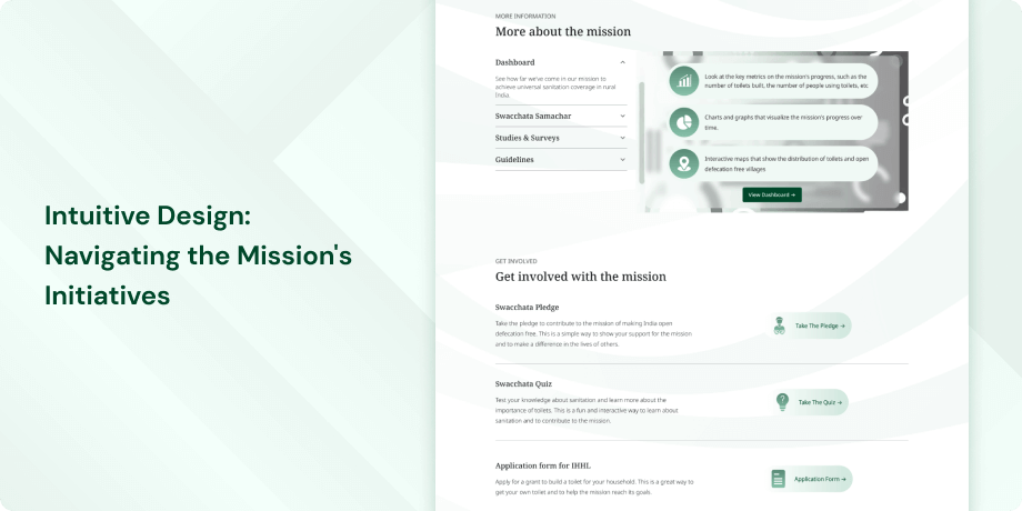
- Button Design- Ensure that buttons such as "Swachhata Pledge" and "Swachhata Quiz" are visually distinct based on their importance. Users should be guided towards the most critical actions aligning with the website's primary goals.
- "Useful Links" Section-Revamp the "Useful Links" section by incorporating visuals and vibrant colors to enhance user engagement. A visually appealing design can contribute significantly to the overall appeal of this section.
- Sticky Social Media Icons- Consider making the social media icons less obtrusive or providing an option to hide them. Persistent positioning may distract users from consuming content, so finding a balance between visibility and subtlety is crucial.
- Content Alignment-Ensure that the homepage effectively represents all the essential pages and information. Misalignment can lead to confusion, hindering users from easily discovering and accessing relevant content.
- Value Proposition-Incorporate prominent banners, taglines, or welcome blurbs to clearly communicate the website's unique benefits. A compelling value proposition will entice users to explore further.
- Visual Design-Revise the overall visual design by focusing on elements such as color scheme, layout, and visual hierarchy. A visually compelling and inviting design is key to encouraging user engagement.
- Navigation and Consistency-Enhance the footer by adding useful links for quick access to important pages. Consistency in navigation aids in creating a seamless user experience.
- Call-to-Action Placement-Optimize the placement of the "Download Swachh Bharat Ringtone" button for better visibility and engagement. Strategic placement within a dedicated section can enhance user interaction.
- Contact Information-Include essential contact information like phone numbers, email addresses, and physical addresses in the footer for quick and convenient access. This addition improves usability and facilitates user interaction.
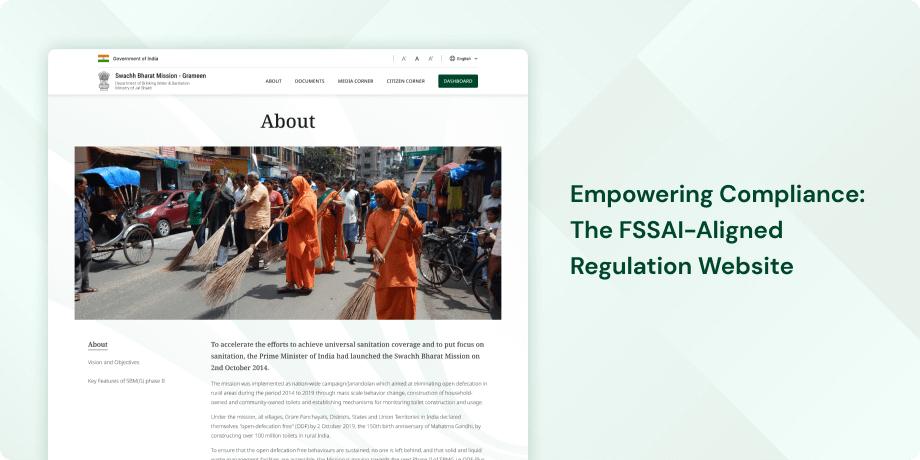
- Information Clarity-Improve the About Us page by effectively conveying the mission's objectives and the chronological order of events. Emphasize that the website relates to phase 2 of the mission following the conclusion of the first phase in 2019.
- Message Clarity-Incorporate key quotes or impactful statements on the About Us page to concisely convey the mission's goals and impact. Memorable statements can enhance message clarity and user engagement.
- Consistency- Ensure consistency in naming between the "About SBM" section on the homepage and the internal "About Us" page. Consistent naming conventions contribute to clarity and a seamless user experience.
- Document Pages-Provide context and categorization for downloadable documents such as handbook, technical notes, and studies & surveys. Additional details help users understand the content and purpose of each document, improving navigation and usability.
- Search Functionality-Optimize the search functionality on the "Press Release" page by allowing users to submit their search query by pressing the "Enter" key. Consistency in design ensures an efficient and user-friendly experience.
- Content Sharing-Add content sharing options to individual press release pages for easy distribution through social media platforms or email. Enhancing sharing options improves content dissemination and user engagement.
- Information Relevance-Ensure information relevance on the press release page by avoiding unrelated starting and ending dates. Clear and relevant information is essential for an effective user experience.
- Filtering Options-Introduce filtering options on the "Swachhata Samachar" page to help users navigate and find specific newsletters based on date, topic, or edition. Enhanced filtering options improve user navigation and usability.
- Button Clickability-Improve button clickability on the "Swachhata Samachar" page by enlarging the clickable area for PDF and eBook downloads. Enhanced usability ensures users can access downloadable content more easily.
- Visual Presentation-Enhance the visual presentation of social media posts by addressing subpar visual elements and updating content regularly. A visually appealing and dynamic presentation contributes to user interest and engagement.
- Information Presentation-Adopt an accordion-style format for the FAQs page to improve information presentation and space efficiency. This format streamlines content, making it easier for users to scan and locate relevant information.
- Interaction Design-Align the interaction design on the FAQs page with user expectations. Ensure that clickable questions do not disrupt the reading experience and behave intuitively.
- Content Organization-Reorganize the "FAQs" page for better contextualization and user understanding. Combining information from different phases may improve overall comprehension of the mission.
- Visual Presentation-Improve visual presentation and content freshness on the login screen by making the OTP field active only when a mobile number is entered. This adjustment enhances clarity and user experience.
- User Notification-Enhance user notification when clicking on the "Citizen Charter's" button, directing users to an external website. Clear notifications ensure users are aware of changes in browsing context.
- Error Handling-Improve error handling on the "Grievance Redressal" button to avoid directing users to an error page. Clear user guidance ensures a smoother and frustration-free experience.
- Website Performance-Address loading issues, including logo loading problems and error logos. Ensuring a smooth website performance is crucial for visual consistency and positive user experience.
- External Links-Notify users in advance when links in the header redirect them to external websites. This improvement contributes to both website performance and visual consistency.
- Discoverability and Navigation-Enhance discoverability and navigation for important pages related to the SBM campaign. Users should easily explore and engage with key information and actions.
- Navigation Differentiation- Visually differentiate navigation elements from ads to avoid user misunderstanding. Clear visuals can easily identify and interact with intended website features.
- SBM Logo Navigation-Ensure clicking on the SBM logo in the header directs users to the homepage, maintaining navigation consistency and meeting user expectations.
- Navigation Aid and Visibility-Adjust the placement of breadcrumbs for better visibility and accessibility. Breadcrumbs are valuable navigation aids and should be positioned for effective utilization.
- Window Behavior-Consistently adhere to the principle of ensuring new windows spawned by the site do not confuse the user. Consistent window behavior contributes to user clarity and a seamless browsing experience.
In summary, addressing these specific areas of improvement will contribute to a more user-friendly, visually consistent and engaging website.
Synthesizing Phase
With the insights gathered during the research phase, we have gained valuable understanding of the users' interactions and challenges while using the website of the Swachh Bharat Mission (Gramin) a statutory body of the Government of India. Building on this knowledge, we have now entered the Defining phase, where our aim is to deepen our comprehension and transform the research findings into practical design solutions. To maintain a user-centric approach, we have created personas that embody essential user archetypes-
User Personas Persona 1: Rajesh, Rural Resident Background-Rajesh, a 45-year-old farmer from a small village in Rajasthan, aims to stay informed about the Swachh Bharat Mission (Gramin) Phase 2 and actively participate in maintaining open defecation-free practices in his community.
Goals-His primary goal is to access relevant information on sanitation, hygiene, and the progress of the mission in his region. Rajesh is keen on understanding the initiatives that can help improve the cleanliness and well-being of his village.
Pain Points-Rajesh faces challenges in navigating the website due to limited digital literacy. He prefers simple and straightforward information presented in a language he can easily understand. The website's mobile responsiveness is crucial for him as he primarily uses his smartphone to access the internet. Rajesh may also encounter difficulties in finding specific information quickly, and he values a user interface that is intuitive and easy to navigate.
Persona 2: Anjali, Government OfficialAnjali, a 35-year-old government official working in the rural development department, aims to gather comprehensive data and updates on the Swachh Bharat Mission (Gramin) Phase
Goals-Her primary goal is to ensure effective implementation of sanitation and hygiene initiatives in her assigned region. Anjali is looking for detailed reports, statistics, and success stories to inform her decision-making and allocate resources strategically.
Pain Points-Anjali faces challenges related to the website's data accuracy and consistency. She requires reliable information to present to higher authorities and stakeholders. Anjali's busy schedule emphasizes the need for a website that streamlines the search process and provides informative feedback efficiently. As a government official, she values accessibility and a user interface that aligns with professional standards, enabling her to quickly extract the necessary information for decision-making.
Mapping User Journeys and Extracting InsightsWe are focusing on Rajesh, a 45-year-old farmer from a small village in Rajasthan, to delve into the specific needs, pain points, and behaviors of users seeking information on the Swachh Bharat Mission (Gramin) Phase 2 through the mission's website.
Our user persona, Rajesh, a dedicated farmer, highlights the motivations and challenges faced by users aiming to enhance cleanliness and well-being in their villages. By outlining Rajesh's journey and experiences on the mission's website, we aim to visualize his interactions, emotions, pain points, and overall user experience while accessing essential information for his community's well-being.
Mapping the journey to a “user story”After analyzing Rajesh's user journey map, valuable insights into actions, emotions, and pain points emerge. This journey map, tailored to Rajesh's objectives and requirements, reveals critical touchpoints and areas for enhancement. From these observations, we distill one of Rajesh's key needs into the following user story:
Rajesh’s User Story"As a farmer dedicated to the well-being of my village, I want to easily access and understand information about sanitation initiatives on the Swachh Bharat Mission (Gramin) Phase 2 website through my smartphone. Clear instructions and success stories will inspire me to actively contribute to the mission in my community."
Framing challenges and hypothesisAnalyzing Rajesh's user journey as a farmer seeking information on sanitation initiatives, we formulate a problem statement encapsulating his challenges.
Problem StatementRajesh, a farmer with limited digital literacy, faces challenges in accessing and understanding information on sanitation initiatives. The lack of mobile optimization hinders his ability to contribute effectively to the Swachh Bharat Mission in his village.
This problem statement guides our design efforts to address Rajesh's needs and enhance his overall experience on the mission's website. Building upon this, we formulate a hypothesis based on an in-depth analysis of user insights and pain points.
Hypothesis StatementIf we create a mobile-friendly interface with simple language and provide quick access to local sanitation initiatives, Rajesh's engagement with the Swachh Bharat Mission (Gramin) Phase 2 website will improve. This will empower him to actively participate in maintaining open defecation-free practices in his community. We believe that by addressing the identified challenges and implementing user-centric solutions, Rajesh will have a more productive and satisfying experience while accessing resources related to sanitation on the mission's website.
In the following sections, we embark on a creative journey to transform these insights into concrete design solutions, aiming to improve Rajesh's experience on the Swachh Bharat Mission (Gramin) Phase 2 website through collaborative ideation and thoughtful discussions.


